How to shade coloring pages: follow the light
Use a single light direction and a few gentle layers to give coloring pages depth, from rounded mushroom caps to folded paper.
A little shadow can make a mushroom cap feel rounded or lift a cherry from the frosting beneath it. You don’t need to shade every detail. One deeper edge is often enough to begin.
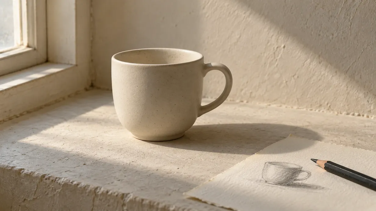
Imagine a window beside the page. Keep the side facing it light, then let the color deepen as the shape turns away.
Put the light somewhere you can remember
Choose a direction before you start. Top left is a comfortable place to try, though any direction can work.
Draw a tiny arrow in the margin if it helps. When you return to the page later, it will remind you which side of each shape catches the light.
Keeping the direction consistent makes it easier to understand the picture as a whole.
Notice two kinds of shadow
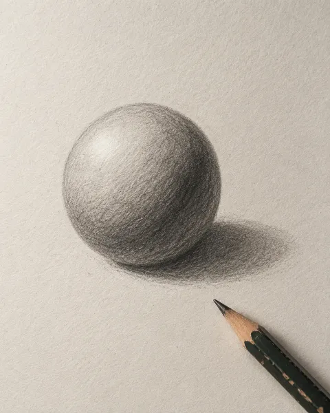
A form shadow belongs to the object itself: the darker side of a round cherry, for instance. On curved surfaces, the change is usually gradual.
A cast shadow falls onto something else. A mushroom cap shades its stem; a leaf may shade the leaf beneath it. Look for places where one shape overlaps another.
Cast shadows often have a firmer edge close to the object and a softer edge farther away. For a first page, a narrow dark patch beneath an overhang can suggest enough depth on its own.
Try a shadow color on scrap paper
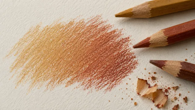
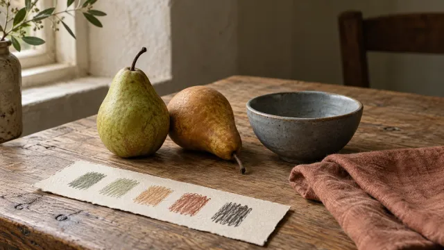
A deeper version of your base color is an easy starting point. Pale peach might take a warm brown; a mint leaf might take a deeper green.
You can also try a thin layer of violet over a warm color. Keep it light and test first. Complementary colors can mute each other, which is useful for some shadows but can dull a bright area if you add too much.
Black and gray have their uses, too. Choose them when they give you the effect you want. Shadows aren’t always cool; their color depends on the light and the surrounding surfaces.
Here is the palette from our mushrooms example:
- Apricot#FFD6A0
- Sand#D8B887
- Lavender#D1BEF0
- Pistachio#BDE2AA
- Mint#B5E6DC
Follow the curve
On a mushroom cap, ease from a light upper surface into a deeper shade as it curves away. Keep the transition broad enough to feel rounded.
The stem is closer to a cylinder. Try a pale vertical area on its lit side and a darker band on the opposite side. You can explore reflected light later: a faint lightening within the shadow where nearby surfaces bounce light back.
For now, concentrate on making the lit side and shadow side feel different. Our pencil blending guide can help soften their join.
Let folds change more sharply
Folded paper behaves differently from a round cap. On the muffin case, neighboring pleats can alternate between lighter and darker values, depending on which way they face.
The frosting above is softer, with little cast shadows beneath its drips. Leave the drawn highlights on the cherries bare if you want a glossy finish.
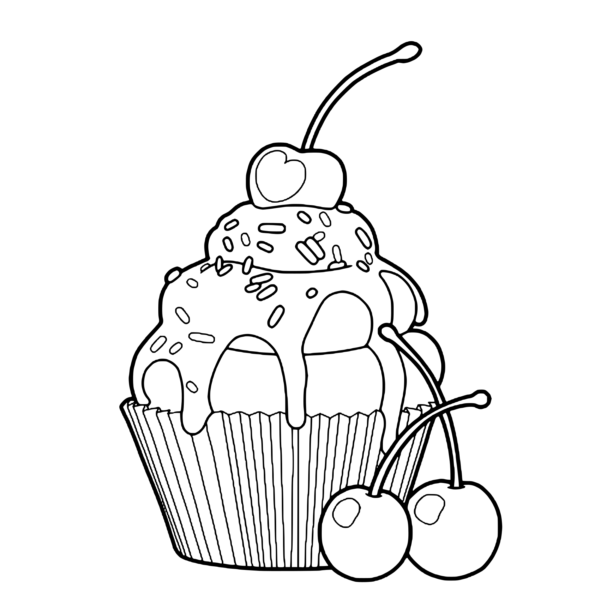 Free coloring pageMuffin coloring pageDownload PDF or color it in Linea →
A small practice on the mushrooms
- Mark the light direction in the margin.
- Add a pale base, keeping a little white where the light catches each cap.
- Deepen the sides facing away from the light.
- Add a small shadow beneath each cap on its stem.
- Step back and choose whether anything needs another layer.
Look from a little farther away
Squint gently or photograph the page in black and white. This makes differences in lightness easier to notice. If a shadow disappears, deepen it only if you want that shape to stand out more.
Soft pastels can stay soft. A page doesn’t need dramatic contrast to feel complete.
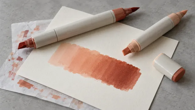
With alcohol markers, work neighboring shades together while the ink is damp; our marker guide explains how. In Linea, the wet watercolor brush lets you explore a soft shadow while color stays within the outline.
Try one cap first. Then take a moment to see what that small change has done.
Practice on your own drawing
Take a photo of a sketch and Linea turns it into a page you can fill.