Color palettes for a quiet afternoon
Six color palettes with hex codes, plus simple ways to borrow colors from everyday things and make them your own.
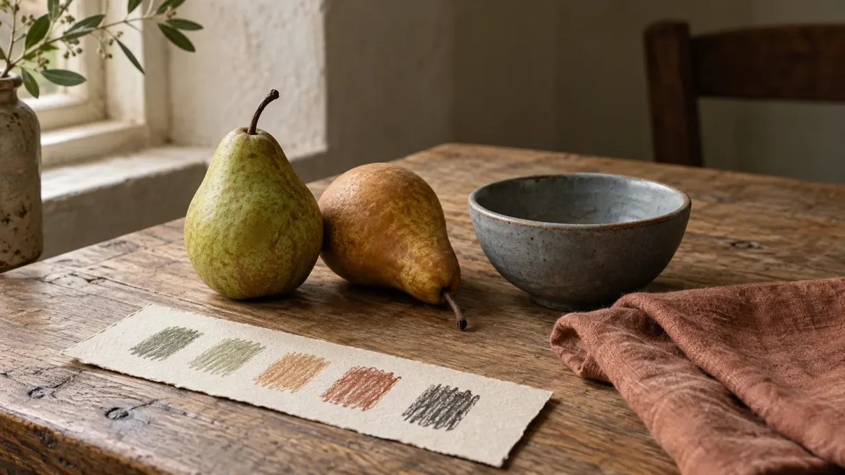
A palette can begin with something small: the pink inside a shell, a faded quilt, the green of a pear beside a blue bowl.
You don’t need to work out every color before you start. A handful that feels good together gives you somewhere to begin, and fewer choices to make as you settle into the page.
Put a few colors beside each other
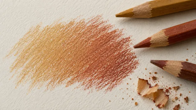
Try four to six pencils on a scrap of the paper you’ll be using. Let one color cover a broad area, then keep another for a small detail you want to notice.
A little coral on a bird’s breast looks different from coral across the whole sky. The amount you use matters as much as the shade itself.
If you enjoy a crowded tin and a page full of color, keep going. A small palette is simply one way to give the picture a little breathing room.
Look for light and dark
Value describes how light or dark a color is. Several different hues can look surprisingly similar once you take the color away.
Photograph your swatches and try a black-and-white filter. If you want clear shading, include a darker color that stands apart from the pale ones. The shading guide explains where to use it.
A pastel page can work beautifully with a narrow range of values, especially when the outlines already describe the shapes. You only need stronger contrast if it helps the picture you want to make.
Borrow from something you love
Look at a painting, a piece of fabric or a photograph you’ve taken. Choose a few colors you notice first, then try them together on paper.
Neighboring colors, such as blue and teal, often make gentle transitions. Opposites, such as orange and blue, can give a small detail more presence. Softer versions work, too: a peach flower beside muted blue leaves needn’t feel bright or busy.
Warm and cool are relative. A yellow can look cooler beside gold and warmer beside green. Let your swatches show you what happens rather than trying to solve it all in your head.
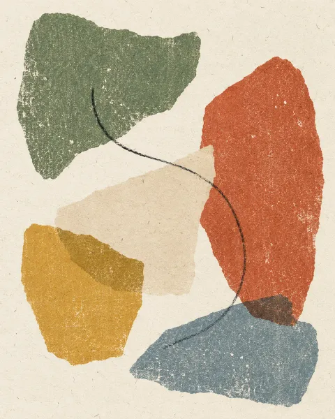
Six palettes to try
The hex codes are useful for digital coloring. On paper, choose the closest shades you own and adjust by eye; screen color and pigment won’t match exactly.
Cozy autumn
Start with cream across the larger shapes. Rust suits a muffin case or an autumn leaf, while dark cocoa adds depth beneath an edge.
- Cream#F3E3C3
- Tangerine#E3A857
- Sage#8FA05E
- Terracotta#B5582E
- Cocoa#4A3226
Pastel morning
Pale peach and blush sit softly beside sky blue. The dusty periwinkle gives you a deeper note for a shadow or a few small petals.
- Cream#FBE3D6
- Blush#F6C1C7
- Sky blue#C9DDF2
- Buttercup#F7EBA8
- Slate blue#7F8FB8
Forest floor
A mushroom cap in bark brown, with greens gathered around its stem. Save the deepest olive for little pockets beneath the caps.
- Sand#DCD3B0
- Sage#A3B26B
- Forest green#5E7A4A
- Cinnamon#8B5A3C
- Ink black#3B3A2E
Sea glass
Mint and turquoise suggest shallow water. Sand adds a touch of warmth, and the deep blue can gather in the shadows of shells or stones.
- Cream#E8F1EC
- Mint#B5DCCF
- Turquoise#7FB7B2
- Midnight blue#35577A
- Sand#D9C7A7
Bird on a branch
Orchid pink and peach bring warmth to the bird, with blues around it and a little butter yellow where you’d like the light to fall. This palette comes from our colored example.
- Orchid pink#EEC8E5
- Peach coral#FDA997
- Sky blue#AAD2F0
- Buttercup#F8E997
- Slate blue#95B4CA
Capybaras in a hot spring
Warm pastels for the capybaras, mint for the water and pistachio for the leaves. These colors stay close in lightness, letting the line art carry much of the shape.
- Buttercup#FAEA97
- Peach coral#FEAA97
- Orchid pink#EFC8E6
- Mint#B5E6DC
- Pistachio#BDE2AA
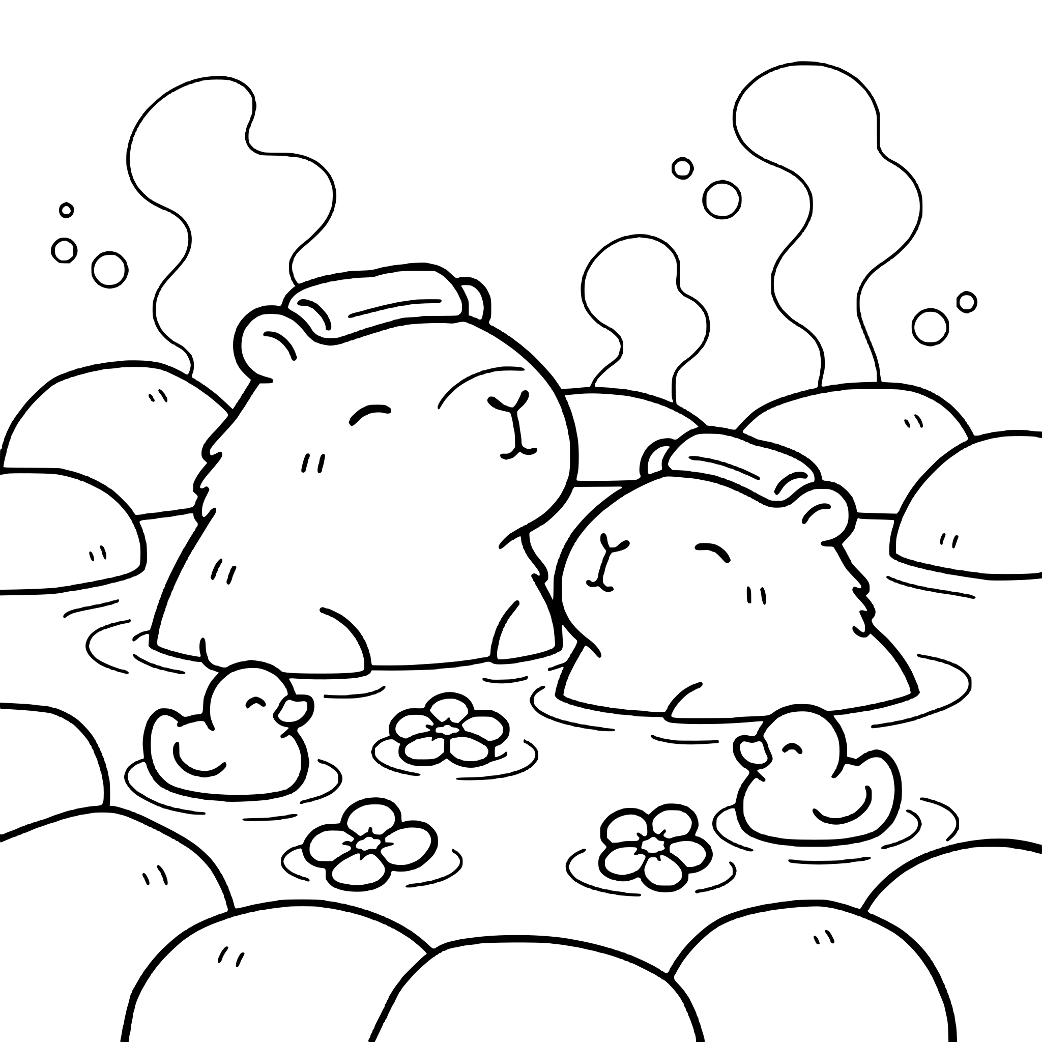 Free coloring pageCapybaras in a hot spring coloring pageDownload PDF or color it in Linea →
Keep the combinations you return to
Swatch a favorite palette on a little card and write the pencil names beneath it. Try each color lightly and then with a few layers, so you can see its range.
Linea makes room for this kind of experimenting: trying a wash, changing your mind and coloring the same drawing in another mood. A familiar page can feel quite different in sea glass blue.
Practice on your own drawing
Take a photo of a sketch and Linea turns it into a page you can fill.