Coloring with watercolor: a softer way to begin
Start with pale washes, leave a little white and build color at your own pace, on paper or with watercolor brushes in Linea.
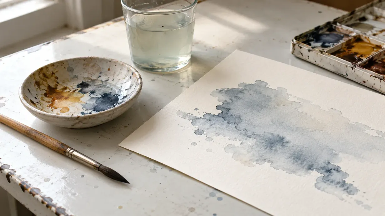
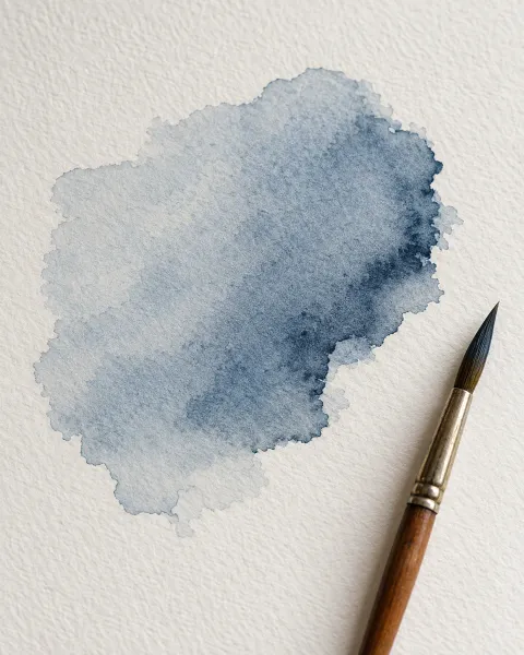
Touch a damp brush to paper and the color settles into a shape of its own. A pale wash gathers at an edge. Two colors meet and soften.
Watercolor leaves room for these small surprises. Begin with a little paint and give yourself time to see what it does.
This guide starts with watercolor on paper, then looks at how the same ideas can guide digital brushwork.
Make a little space for water
Choose watercolor paper, a soft brush and a few colors. Keep clean water and a scrap of the same paper beside you for testing.
If you’re using a printed coloring page, check that both the paper and the outlines can take a damp brush. Our paper guide covers what to look for before printing.
Mix a pale wash on your palette. Test it on the scrap, then let it dry: watercolor often looks lighter once the water has gone.
Decide what stays light
Transparent watercolor lets the white paper show through. That white is part of the color, especially in a pale wing or a bright spot on an eye.
Before painting, choose a few areas to leave untouched. Then brush your palest wash across a larger shape. It can be lighter than you think it needs to be; you’ll have room to deepen it later.
Let the edges do different things
On dry paper, a wash usually keeps a clearer edge. On a lightly damp surface, paint spreads and the edge softens.
Try both on your scrap. A crisp edge might suit a leaf, while a soft one could suggest the rounded side of a bird. If the surface is puddling, blot your brush and lift a little excess water before adding more paint.
There’s no need to keep brushing as the wash begins to dry. That half-dry stage can leave uneven marks when disturbed. Let it settle, then decide what to change.
Build depth after the first wash dries
Wait until the paper is dry before adding a separate transparent layer. A deeper wash along one side of a wing can suggest its curve while the first color still glows beneath it.
For colors that mingle, work while the first wash is damp instead. These are different effects; choosing between them gives you more control than repeatedly brushing the same patch.
Keep a few colors within reach
A small palette makes it easier to notice how colors change when they meet. Try pink beside violet, then leave a little space between washes if you’d rather keep them distinct.
- Lilac#C394E6
- Rose pink#F1ADCC
- Candy pink#FEADC5
- Orchid#D39DE1
- Periwinkle#A49EFB
These are digital color references. With paint, use the closest colors you have and test their mixtures; pigments behave differently from colors on a screen.
Carry the idea onto a screen
Digital watercolor brushes vary. Some imitate a dry edge, while others blend with color already on the canvas. Try a pale stroke and a second stroke across it before beginning your page.
Linea’s wet watercolor brush picks up and mixes with the color beneath it. You can explore those overlaps within the outlines, keeping your attention on the wash as it changes.
Start with one wing
The bird page offers small feather shapes and a broader wing for trying a pale wash beside a deeper layer.
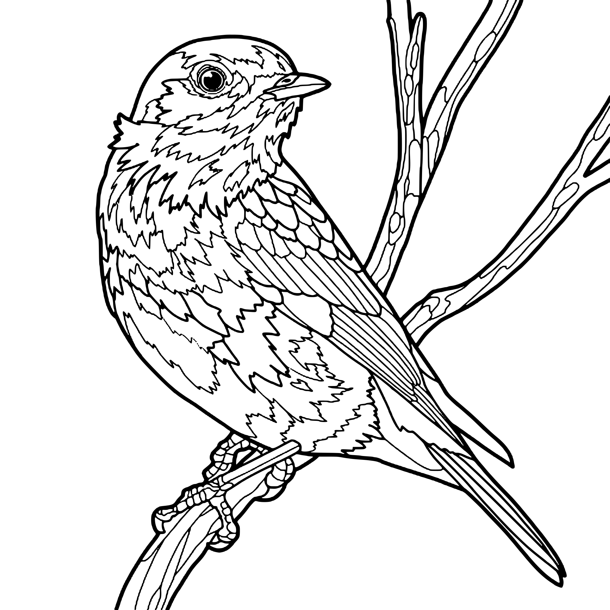 Free coloring pageBird on a branch coloring pageDownload PDF or color it in Linea →
Color a few feathers and pause. Leave the page somewhere you can see it while it dries. Often the next mark is easier to choose after a little time away.
Practice on your own drawing
Take a photo of a sketch and Linea turns it into a page you can fill.